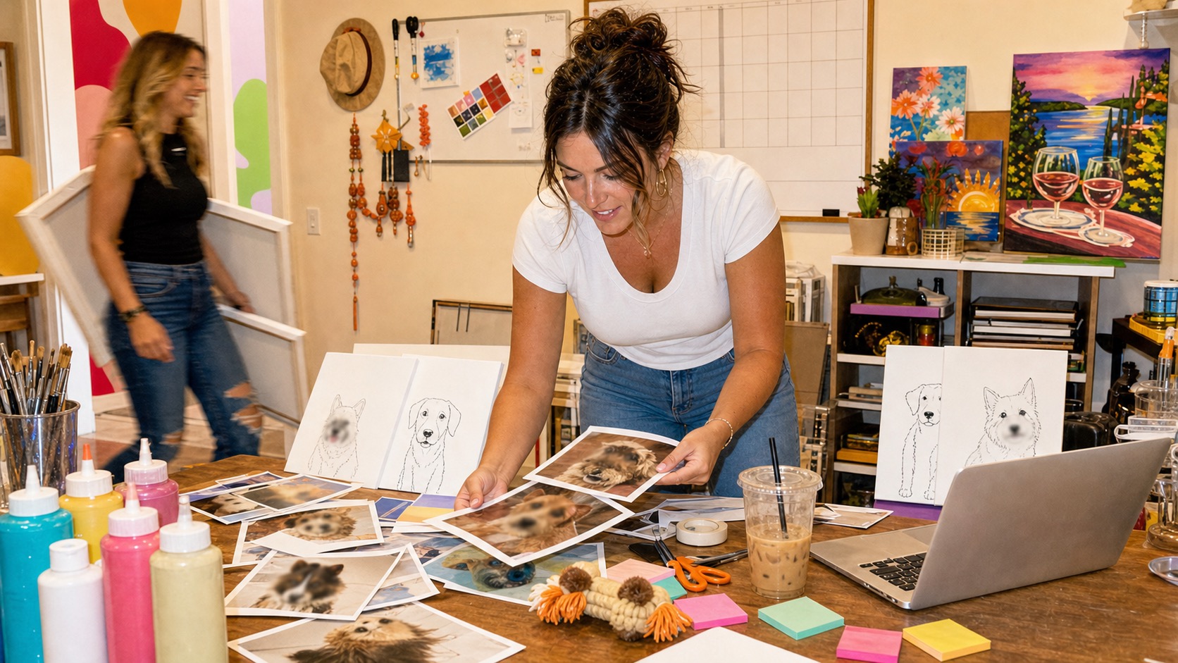
To turn a photo into paint by numbers, use a converter to simplify the picture into colour regions, then check the numbered outline, colour key, and intended print size. The useful result is a design you can follow with a brush. A pretty preview is only part of the job.
For a pet portrait, pay special attention to the eyes, nose, ears, and markings. If those disappear when the picture is simplified, adding a thousand tiny shapes will not necessarily save it. A different photo or closer crop may do more.
Here is a practical workflow, from camera roll to painting surface, with the decisions that are easiest to fix before you start printing.
Have a pet photo ready? Try your pet photo and choose a stencil or numbered guide. Your own artwork requires sign-in and payment; paints and canvas are not included.
What a photo-to-paint-by-numbers converter does
A converter groups similar colours, draws boundaries between regions, and assigns numbers that correspond to a palette. You paint each numbered region with the matching colour.
Controls differ by product. Davincified’s generator, for example, describes separate colour-count and difficulty settings. That distinction is useful: how many colours you must manage and how many small shapes you must paint are related, but they are not the same question.
Before choosing a tool, look at what it actually gives you. A coloured preview, a printable numbered outline, and a colour key serve different purposes. A digital file also does not supply the physical paints or canvas.
This guide covers the general preparation process. Use the instructions for your chosen tool to confirm its supported files, controls, and output.
1. Start with the clearest useful photo
Find the original image if you have it. A copy saved from a message or a screenshot may contain less detail than the original photo.
For a pet, look for a visible face, enough space around the ears, and a background that does not hide the outline of the body. Skip a picture where you must explain which dark patch is the eye.
Pinot’s Palette Appleton’s photo advice supports clear, unobstructed subjects and high-resolution files. Its article was published in 2017; the useful reference here is photo selection, not current class arrangements.
Our suggested comparison is simple: choose two possible pictures and view each at roughly the size you want to paint. Which one makes the pet recognisable with less effort? Start there.
For other subjects, use the same question. A single flower against a plain wall is a different first project from a family reunion with twelve small faces. Choose complexity deliberately.
2. Decide the finished shape before cropping
Choose whether the painting will be tall, wide, or square. Then make a crop that fits that shape without cutting off a feature you want to keep.
Imagine a tall photo of a sitting dog going onto a square panel. You have three useful choices: crop some background, include less of the body, or choose a different panel shape. Stretching the image sideways changes the dog’s proportions.
Keep an untouched copy of the photo. Make crop experiments on a duplicate so you can compare options and return to the original.
If you are preparing a photo for a studio class, pause here and follow its submission rules. The studio may want to make the crop itself. A home-template workflow should not override the instructor’s preparation process.
3. Give the subject more of the picture
Consider what deserves your painting time. If your pet occupies one corner, the converter may spend much of the design on grass, floorboards, or furniture.
A closer crop can give the face more space. A simpler background can reduce the number of distracting regions. Keep enough breathing room around the pet that the portrait still feels intentional.
If your chosen editor or converter offers background changes, compare the result carefully. Check the edges of ears, whiskers, and fluffy fur. An automatic edit may remove something you wanted to keep.
For a first attempt, our recommendation is a plain background colour that separates the pet from its surroundings. You can tackle the detailed garden in a later painting. The dog does not need a fully rendered hedge to be the main character.
4. Choose colour count and detail separately
Start with the tool’s simpler setting and inspect the preview before increasing detail. There is no universal best colour count for every photo or every painter.
Use two questions:
- Does the palette keep the important differences? Check whether the muzzle, eyes, coat markings, and background still stand apart.
- Are the regions comfortable to paint at the final size? A design can use relatively few colours and still contain hundreds of fiddly islands.
If the image looks flat, try a little more colour variety or a better-lit source photo. If the outline looks like confetti, try less detail, a simpler crop, or a larger painting surface.
Change one setting at a time. Save or compare versions if the tool allows it. Otherwise, it is easy to end up liking a preview and having no idea which change made it better.
5. Check the likeness before the file leaves the screen
Compare the original photo and the simplified preview side by side. Do this before judging individual numbers.
Look at the shape and spacing of the eyes, the angle of the nose, the outline of the ears, and any markings you associate with that pet. For a one-eared cat or a dog with a particular white patch, that feature is part of the portrait.
Then look away for a moment and come back. Does the simplified version still read as your pet, or merely as a pet of the same colour?
Use these checks to catch a weak design while you can still change the photo. If the eyes have merged into a dark block, do not assume the paint will reveal information the template does not contain.
6. Understand the colour key before buying paint
Each region number needs a clear colour assignment. Keep the key with the final version of the template; do not mix an outline from one attempt with a palette from another.
If you are using a digital-only design, find out how the colours are specified. A screen swatch or hex code is a digital colour reference. It is not automatically a paint brand’s product number or a recipe for mixing pigment.
You may need to choose similar physical paints or mix your own. Make small labelled swatches on scrap material and compare them once dry. Pay attention to the relationship between colours, especially adjacent shades that describe the face.
If you want numbered paint pots supplied for you, check whether you are ordering a complete custom kit. Read the actual contents before checkout. A template and a box of matched materials are different purchases.
7. Print a proof at the size you will paint
A proof is a simple test print. It lets you discover that half the numbers are unreadable before you commit to a more expensive surface.
Set the intended dimensions, check the print preview, and inspect the result at normal working distance. Can you read the labels? Can your brush fit into the small regions? Is any part of the design cut off by printer margins?
For raster images, print size and pixel dimensions are connected. Adobe’s print-resolution guidance recommends 300 pixels per inch unless the printer specifies otherwise. As a calculation, an 8-by-10-inch raster image at 300 PPI is 2,400 by 3,000 pixels.
That is a print-planning example, not a minimum upload requirement for every generator. Follow the provider’s instructions for its output format, and judge the actual printed lines and numbers.
8. Choose how the outline reaches your surface
There are two common practical routes: print onto a suitable supported material, or transfer a paper outline onto a painting surface.
Do not put canvas or heavy art paper into a home printer unless the printer and material instructions say they are compatible. If you are unsure, ask a print shop about the specific file and surface.
For a drawn transfer, Winsor & Newton describes using graphite transfer paper between the drawing and canvas, held still while you trace. Test a small area first and keep the transfer light enough to work with.
Transfer the useful boundaries carefully. If the design is numbered, preserve the labels you need or keep a clear numbered reference beside the canvas. An outline without a way to identify its regions is a new puzzle you did not order.
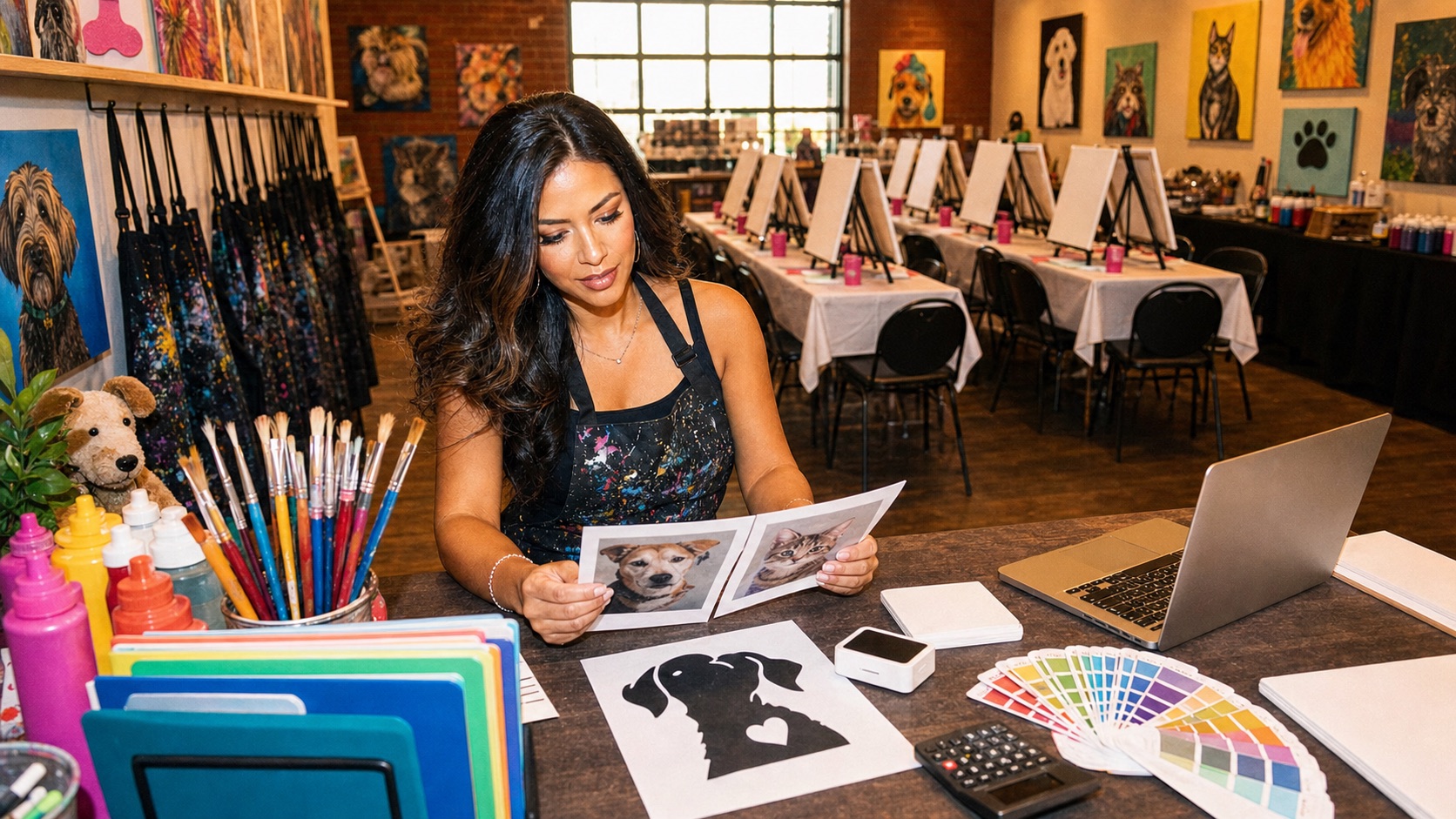
AI-generated editorial illustration of a preparation desk; not a demonstrated printing or transfer result.
When the template looks wrong
| What you see | What to check first | A useful next attempt |
|---|---|---|
| The eyes disappear | Photo lighting and face size | Try another photo or a closer crop |
| Thousands of tiny shapes | Detail setting and busy texture | Simplify the design before printing |
| The pet blends into the background | Similar lightness or colour | Change the crop or simplify the background |
| Numbers are too small | Final physical size | Print larger or reduce complexity |
| Colours look different on paper | Printer output and physical paints | Make a small printed proof and dry paint swatches |
| The outline looks stretched | Crop and print proportions | Keep the intended shape when resizing |
Treat these as starting points for another attempt. They are not guarantees that every source photo can produce a satisfying template.
Questions about photo-to-paint-by-numbers templates
Can any photo become paint by numbers?
Many pictures can be simplified into numbered regions, but some make much better painting projects than others. A clear subject and manageable detail give you more useful information to work with. A blurry or obstructed face remains a difficult starting point.
How many colours should I choose?
Choose enough to keep the features you care about while keeping the physical painting manageable. Compare previews and a test print. Colour count alone does not tell you how difficult the smallest regions will be.
Is a PDF the same as a paint-by-numbers kit?
No. A PDF is a digital document. A physical kit may include a prepared surface, matching paints, brushes, and a reference sheet. Check the stated contents and the work you will need to do yourself.
Can I make the painting bigger later?
You can revisit the design at a larger size, but check the file quality, proportions, and print layout again. Save the original photo and the final template together so you can reproduce the version you chose.
Do I have to trace every tiny region?
You need enough information to follow your chosen design. If tracing every region already feels impractical, simplify the template or increase its physical size before transferring it. Skipping random boundaries can make the colour key harder to follow.
Could a studio prepare the canvas instead?
Yes, some classes include preparation from your photo. Browse paint-your-pet classes, then read the individual event description to check whether the canvas is sketched, printed, or numbered.
Before you set out the paint
If you are still deciding between home and studio, our beginner’s guide to painting your pet compares the two. Ready to use your template? Follow the pet paint-by-numbers painting guide.
Make sure the final outline and colour key match, the labels are readable at the intended size, and you know how the design will reach the painting surface. Keep the original photo nearby as a reference.
If you would rather have someone handle preparation and help with the painting, find a paint-your-pet class. If you are organising that class, our photo-deadline guide for studio owners covers collecting usable pictures before the preparation starts.
Sources
Official studio and art-material guides informed this article. Class policies and product options can change; check the provider’s current details before booking or buying.
- Davincified: photo-to-paint-by-numbers generator
An example of separate colour-count and detail controls; product options vary by provider.
- Pinot’s Palette Appleton: choosing a pet photo
Photo composition and lighting advice from its 2017 guide; current event details may differ.
- Adobe: print dimensions and resolution
How pixel dimensions, physical print size, and print resolution relate.
- Winsor & Newton: drawing and transfer on canvas
Using graphite transfer paper to move a drawing onto canvas.